Some of the
content pages, Sight and Sound and Little White Lies and then Film Stories makes
use of a double content page with more information displayed across the
contents page however this does not mean that the single content pages are uninformative
as they just display information in less copy however remain informative as to
where the readers can find what they are looking for inside of the magazine.
The layout and
composition of the content pages vary across the three different magazines with
Sight and Sound making use of a table layout that separates all of the
information into different sections including what is on each page, reviews and
then contributions to the magazine being displayed within a column, the other two
magazines do not make use of a table layout with Little White Lies making use
of a more basic content page layout without lots of copy however just a list of
the different sections and topics that can be found within the magazine. On the
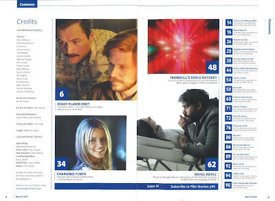
other hand, Film Stories use a double content page displaying the credits on
the first page of the double and then on the second page there is a list of
page numbers and information about what can be found within the magazine.
The content
that can be found inside the different magazines also varies with the Sight and
Sound content page displaying information about Opening scenes, endings and
more along with reviews of different films and then a column dedicated to
mentioning the contributors to this edition of the magazine and who they are regarding
their career and involvement within the magazine. Little White Lies on the
other hand only has one section talking about the feature contents within the
magazine such as the Lead Review on Pink Flamingos and then Film Stories also has
different content with the first of their content pages having a section
dedicated towards credits and then the second page having a column dedicated
towards the contents of the magazine and then in the middle of these columns
there are images from different films that are involved and spoken about inside
the magazine.
The typography
across the content pages from the magazine also varies as some stay consistent
throughout the content page and then some have varied fonts and typography such
as Sight AND Sound who have varied fonts and different sized fonts across the
page. For example, the left-hand column has bold text to show the topics that
can be found within the magazine which is also capitalized and then the extra
detail beneath is a font that isn’t bold and makes use of both lower- and
upper-case text. In Little White Lies these changes remain consistent with
their fonts with the titles of the topics being a bold font and then the extra
detail below being a similar font however not in bold format. Then in Film
Stories the typography remains consistent across the content pages for one edition
however changes from edition to edition as in the first edition they make use
of a bolder pink font for titles and subtitles and then make use of the same
idea but a slightly smaller font and in blue for titles in the second given
edition.
The use of
images varies once again across the different magazines as Sight and Sound uses
images along with Film Stories however Little White Lies do not use any images on
their content pages. In Sight and sound the use of images is little as each
edition has three different images each of the different contributors to the
magazine edition however in Film Stories the images are much larger as they
come with a page number and the images display a scene in a particular movie included
and spoken about within the magazine.
The page numbers
also vary across the three magazines as on Sight and Sound they are very bold
and large above the topics to clearly show the readers which page they need to
turn to so that they can find the topic that they are looking for, the page numbers
vary once again in Little White Lies as the page numbers are much smaller and
less noticeable so that the readers will most likely read the topic before noticing
which page it can be found on. This then varies again on the content pages of
Film Stories as all of the page numbers are in large and brightly colored boxes
across both editions which makes the page numbers very noticeable for the
readers as to where they can find the information or topic that they are
looking for.


No comments:
Post a Comment